
The Mobile-First Era
In today’s digital landscape, mobile devices are often the first point of contact for consumers. With over half of global web traffic coming from smartphones, designing your website with a mobile-first approach is more important than ever. As we move into 2025, mobile-first design is becoming a critical factor for businesses looking to enhance user experience and improve conversion rates.
In this blog, we’ll explore the importance of mobile-first design and why it should be a top priority for your website in 2025.
1. What is Mobile-First Design?
Mobile-first design is an approach where the design and development of a website is prioritized for mobile devices first, before adapting it to larger screens such as tablets and desktops. The idea is to optimize the user experience for mobile users first, ensuring that the site is fully functional and visually appealing on smaller screens.
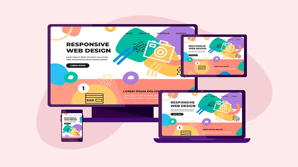
Key features of mobile-first design include:
- Responsive design: Automatically adjusts the layout and content based on screen size.
- Optimized loading speed: Mobile-first sites are designed to load quickly on mobile devices, reducing bounce rates.
- Touch-friendly elements: Buttons, menus, and forms are designed for easy navigation on mobile screens.
2. Why Mobile-First Design Matters
The mobile-first approach offers several key benefits for your website:
- Improved User Experience: Since most users browse websites on mobile devices, a mobile-optimized design ensures a smooth and engaging experience.
- Better Search Engine Rankings: Google prioritizes mobile-friendly websites in search results, meaning that mobile-first sites are more likely to rank higher.
- Higher Conversion Rates: Websites that are easy to navigate on mobile tend to convert better, leading to more sales, sign-ups, and interactions.
- Faster Loading Times: A mobile-first design often results in optimized code and content, which speeds up page load times—a crucial factor for mobile users.
3. Mobile-First Design Best Practices
When designing a website with a mobile-first approach, here are some best practices to follow:
- Simplify navigation: Use concise menus and easy-to-click buttons to make it easy for users to navigate your site on small screens.
- Optimize images and videos: Compress media files to ensure quick loading times without compromising on quality.
- Prioritize content: Keep content short, engaging, and easy to read on mobile devices. Avoid long paragraphs or cluttered layouts.
- Design for touch: Make sure buttons, forms, and links are touch-friendly with enough spacing to avoid accidental clicks.
4. How Exonex Ensures Mobile-First Design
At Exonex, we specialize in mobile-first website design that prioritizes user experience across all devices. Whether you’re launching a new website or revamping your existing one, we’ll ensure that your site looks and performs flawlessly on smartphones, tablets, and desktops.
✅ Conclusion: Mobile-First Design is a Must for 2025
As mobile usage continues to rise, adopting a mobile-first approach is no longer optional for businesses—it’s essential. A mobile-optimized website ensures better user engagement, higher search engine rankings, and improved conversion rates. At Exonex, we design websites with mobile users in mind, ensuring a seamless experience no matter the device.
Ready to Build a Mobile-First Website?
👉 Contact Exonex for Mobile-First Web Design
👉 Let’s create a website that’s ready for the future.
